DESIGNWIRE: A new design forum for the new year

An email this morning, from Australian designer Dale Harris, announced the introduction of a new graphic design forum - DESIGNWIRE: a design community. It is sure to be a great international resource - and already has members from Australia, the United States (California, Georgia, Oregon and Texas), Belgium, Canada, the Philippines, Singapore and the United Kingdom. Check it out for interaction with designers from around the world.

Creative Latitude has already added DESIGNWIRE to the listing of forums at the end of my latest article Funny Things Happen on the Way to the Forums. The piece is a question and answer session, on the topic of forums, with Judy Litt (until recently the guide for the About.com Graphic Design Forum - see previous blog entry), Bryn Mooth (Editor of HOW Magazine and a moderator of the HOW Design Forum, Gavin Laking (Administrator of The Designers Network Forum, and Bob Nicholl (Lead Moderator for the Graphic Design Forum.

Have a safe (and somewhat sane) New Year's Eve!

© 2005 Jeff Fisher LogoMotives

Design studio housecleaning - excavated artifact #3

It's amazing what I've saved over the years in regards to projects I've been contracted to design. The simple Post-It note scribble at the left is just one example of the many preliminary concepts I have come across recently in archiving past projects.

Since I was a kid I have spent a great deal of time in the small Central Oregon town of Sisters, Oregon. The favorite backpacking destination of my family was the nearby Three Sisters Wilderness area. In the 1970's my parents bought property in Sisters, eventually building a vacation home that has been their primary residence for the past 15 years. For many years the Sisters Rodeo, "The Biggest Little Show in the World," has been a family tradition - with an annual weekend party at my parents' home that has become somewhat legendary.

To celebrate the 60th anniversary of the Sisters Rodeo it was determined that it might be time for the organization to finally have an official logo. The Sisters Rodeo Association was already working with my sister's advertising agency, TriAd in nearby Bend, for their advertising, marketing and public relations needs. Sue's firm was asked to take on the identity project and she hired me to create the initial image for the rodeo. In one of our telephone discussions I jotted down a rough type treatment - for a logo that I hoped would convey a hint of the 1940's and be a lasting symbol for the Professional Rodeo Cowboys Association event.

From the beginning of the project I had no doubt the symbol representing this live-action piece of Western Americana would end up being red, white and blue in color. The flags, banners, music and patriotism associated with the rodeo immediately dictated that color palette. I also knew that I wanted a cowboy on a bucking bronco, or bull, as the primary element. Having seen many a cowboy hat fly through the air at previous rodeos, I felt graphically representing that would add a little implied movement - and my own little brand of humor - to the logo. The cowboy graphic fit well into the "O" of my original scribble, and the airborne cowboy hat became the dot of the "i" letterform in the word "Sisters," as the symbol almost designed itself.

The logo has served the event well the past six years - and received several honors. In 2000, the identity was included when the Sisters Rodeo was inducted into the Library of Congress “Local Legacies” archive. The following year the logo was honored with an Award of Merit in the Ad Federation of Central Oregon's annual Drake Awards, a Silver Award in the Summit Creative Awards, and received a LOGO 2001 honor (resulting in the design being published in the book The New Big Book of Logos). The design was also published inLogo Lounge : 2,000 International Identities by Leading Designers.

© 2005 Jeff Fisher LogoMotives

Toot! Toot!*:

Fisher named to Board of Directors of

Professional Graphic Design Association

The Professional Graphic Design Association (PGDA) has officially launched with the announcement of an elected Board of Directors from across the globe. Elected officers to the Executive Committee are Catherine (Cat) Morley, (Bangkok, Thailand), President; Robert Wurth, (Lincoln, Nebraska, USA), Vice President; Mark Astrella, (Maui, Hawaii, USA), Secretary; and Jeanette Wickham, (Melbourne, Victoria, Australia), Treasurer. Members of the Board include Jeff Fisher (Portland, Oregon, USA), Habib Bajrami (Mississauga, Toronto, Canada), Neil Tortorella (Canton, Ohio, USA), Alina Hagen (Los Angeles, California, USA), and Steve Douglas (Mississauga, Ontario, Canada).

The PGDA is a grass roots, international non-profit professional organization with a client (buyers of design) focus. Through their Code of Ethics and Professional Standards, the PGDA will target clients and designers, spreading the value of ethical conduct and professional business practice within the design industry.

The leadership of the PGDA has set ambitious goals for its first year. “I believe the international graphic design community has long awaited an association such as the PGDA — Our overall aim is to create an improved working relationship between clients and designers by providing an excellent one-stop business resource for clients. The PGDA organisation will be formed from top rated members supporting a code of professional business practices.” said Catherine (Cat) Morley, President.

In the coming months the PGDA will be running surveys out of the new PGDA blog to determine the combined needs of clients and designers. Each month survey results will be analyzed and posted. Your opinions are invaluable and participation whenever possible is most welcome.

* If I don't "toot!" my own horn, no one else will

© 2005 Jeff Fisher LogoMotives

bLog-oMotives tickles "Cat's Fancy"

bLog-oMotives is featured in the recently posted Cat's Fancy column on Creative Latitude. With each update, Cat Morley (who wears the multiple hats of principal of Katz-i International Web & Graphic Design, President of the Professional Graphic Design Association and Project Manager for Creative Latitude) features several blogs from the site Designer's Who Blog. She then comments on the blogs and interviews the designers posting their thoughts online.

In addition to bLog-oMotives, the latest Cat's Fancy features Graphic Push by Kevin Potts, Neil Tortorella's Inside the Marketing Mind, The Prepared Mind from Chris Gee, Von Glitschka's art backwash, the Freshly Squeezed droplets of Robert Wurth and Angela Mittan, Adholes by Jesse Tayler and Marc Lefton, Jeff Andrews' Design Inspiration, Dot's Market from Lisa Duty, and Elisabetta Bruno's Creative Expression.

© 2005 Jeff Fisher LogoMotives

Merry Christmas - and happy (insert your holiday here) - to one and all.

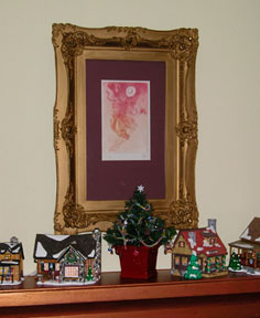
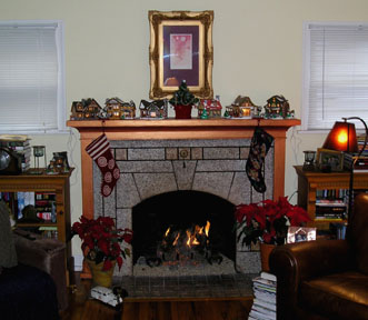
It's Christmas Eve day and the stockings are hung by the fireplace with care - and that's about all that got accomplished this season. The holiday cards are not all done and most are still scattered on the dining room table awaiting personal notes, addressing or stamps. Not a single gift has been wrapped - in fact, there is still a bit of shopping to be done. No gifts have been shipped to individuals in other cities yet. Thankfully, Uncle Amazon (and other online vendors) were very helpful in getting some packages delivered. We never did get the lights up on the outside of the house, but I did manage to get some in the big windows in the living room and dining room. I never found the old rolled-up red vinyl to turn the white pillars on the porch into over-sized candy canes. I did manage to get my collection of rustic holiday village buildings set up around the living room.

The big shock to family and friends is that we didn't put up a tree this year. Actually, we haven't had one the past two years either. Last year we were in San Francisco having Christmas with my sister. Two years ago we were leaving right after Christmas to spend New Year's with our friends who were living in Puerto Vallarta. Trees were an inconvenience in those years. This holiday it just seemed like a chore that would take too much time and energy. After all, hunting down and killing a tree, and then determining which of the 600+ rocking horse ornaments would make the cut for display, is a lot of work

Last weekend we were on the incredible boat of friends Anne & Jon, watching the Christmas Boat Parade, and I mentioned we didn't put up a tree. Anne seemed a bit stunned. A couple days later she stopped by with a fabulous bottle of champagne and a large gift bag. From the bag she pulled a little nine-inch tall tree, in a green and red basket, all decorated with miniature garland, tiny ornaments and tiny gingerbread men. She said we had to have a tree. It suddenly felt much more like Christmas around our house.

We certainly aren't "bah, hum bugging" Christmas this year. We've just had a lot going in recent months, personally and on the professional front. We've gone to several great holiday parties in both Portland and Seattle. The 50+ Christmas CDs are on constant "rotate" on the stereo system. I had a wonderful, and hilarious, Christmas breakfast yesterday with my weekly "koffee klatch" gang of Don, Ron, Steve and Myra. Tess, the seven (and a half!) year-old daughter of our friends Tim and Kristin, is in the kitchen right now making cookies with Ed (The warm snickerdoodles are fan-frickin'-tastic!). Christmas Eve will be quiet - Ed and I will enjoy crab cakes and champagne in front of the roaring fireplace of gas-logs that we bought the house as a Christmas gift last month. Tomorrow his entire family will arrive for a big Christmas dinner and later in the evening we will have another celebration with our friends Shawn and Greg, their daughter Lily and the rest of their family. On Monday my college fraternity buddy Greg, and his kids, - visiting from San Diego - will come over for breakfast. Monday night is our annual ham and latke Hanukkah-fest, and Boxing Day, dinner with friends Mary, Kate, Lisa, Bev and whomever else may stop by. Over the weekend there will be the calls to, and from, friends around the country

So, maybe this Christmas is not the perfect Martha Stewart holiday celebration, but we will have the opportunity to spend some wonderful time with those most important to us - and for us that's what the holidays are all about. That, and reflecting on the wonderful holiday times we spent in the past with the four dear friends - Sharon Nixon, Brad Hall, David Coyle and Glo Raineri - we lost to various illnesses in the past nine months. They, and their families, are in our thoughts this holiday season - as are our friends Carol (whose aunt passed away last week following a fall) and Marc (whose brother lost his battle with cancer this week).

Merry Christmas, Happy Hanukkah, a joyous Solstice and best wishes for whatever holiday you may be celebrating at this time! (People need to get over the overly PC stuff - there's enough room for the holiday celebrations of all beliefs.) Thanks to all the design professionals and friends, from around the world, who have sent cards, e-cards and wonderful holiday messages.

Hugs, Jeff (and Ed, too!)

Funny things happen on the way to the forums

In late 1998 I finally joined the online design community from my home-based design studio in Portland, Oregon. Having been a one-person operation most of the 27 years I have been in the design field, I did occasionally experience bouts of isolation from the rest of the world. That was about to change.

Judy Litt (until recently the guide for the About.com Graphic Design Forum - see previous blog entry), Bryn Mooth (Editor of HOW Magazine and a moderator of the HOW Design Forum, Gavin Laking (Administrator of The Designers Network Forum, and Bob Nicholl (Lead Moderator for the Graphic Design Forum graciously agreed to answer a series of questions from me about the forums in which they are involved, and forums in general.

Read the entire article, Funny things happen on the way to the forums, at Creative Latitude.

© 2005 Jeff Fisher LogoMotives

New calls for entries: From Index Books in Spain

The Spanish design book publishing company Index Book has issued to calls for entries for two upcoming design volumes. The first is Nude (Just Labels) by Ignasi Vich. The book will feature labels design for products that - because of shape, specific requirements or shipping restrictions - require exceptionally strong labels for identification or purchase persuasion. Vich also wrote the Index Book offering Mute (Just Pictograms).

The second call for entries is for Josep M. Garrofé's upcoming book Structurall Cards. The book will feature invitations, greeting cards and other designed items that stand out due to unique aesthetics or original concepts. Garrofé is the author of the recently published Structural Packaging.

Additional information about submission requirements may be found at the links for the two books.

Index Book publishes some excellent design resources. Some of my own work is included in one of their latest releases, Logos from North to South America by Pedro Guitton. In fact, my designs for the Peninsula Clean Team, Coyner's Auto Body, Oregon Family OUTings, and the play "Caught in the Net" (all Oregon clients) are featured on the Index Book promotion page for the volume. I look forward to seeing an actual copy of the book in the near future.

© 2005 Jeff Fisher LogoMotives

Wine, books, beer - and a dash of "gonzo" for good measure

I've always been a fan of the work of artist, illustrator and writer Ralph Steadman. Ever since first seeing his "gonzo" art pieces years ago (related to the "fear and loathing" days of association with Hunter S. Thompson) I have been fascinated with his frenetic, statement-filled work. In part, I think I've appreciated the free-from nature of what comes from his pen due to the fact my own work is made up of rather anal-retentive, hard-lined, structured efforts.

A respected oenophile, Steadman recently announced the release of his new book Untrodden Grapes, the follow-up to his previous volume on the world of wine, The Grapes of Ralph: Wine According to Ralph Steadman. Through his travels to notable vineyards in California, Chile, Spain, France, Italy and South Africa, his unique and vibrant illustrations, and the prose of a curmudgeon, Steadman presents the reader an off-beat look at wine-making and some great wines. The mixture of incredible art, entertaining writing, and travel tales got me hooked. I now need to check out some of the other books he has created.

In addition to his books, illustrating the writing of others (such as a new edition of Ray Bradbury’s Fahrenheit 451), T-shirts, limited edition prints, posters and other items, Steadman brought his work to the masses as the packaging illustrations for Flying Dog Ales. Be sure to check out their site - especially the page about the "gonzo" connection. I really enjoy going into a grocery store and seeing Steadman's offbeat labels among all the stuffy designs in the beer cooler.

Learn more about Steadman, and see additional examples of his work, at the Creative Refuge site, where you will find Mike Buchheit's interview The Pen is Mightier as a Sword: Talking with Ralph Steadman. At the Creative Refuge site you can also download the Steadman-inspired font "Collateral Damage" by Chris Hunt, courtesy of Chank.com. A visit to poke around Steadman's own site is also worth the cyber adventure.

© 2005 Jeff Fisher LogoMotives

Judy Litt: Thank you, you will be missed, and good luck in the future

Judy Litt, the guide for the About.Com Graphic Design site, posted the following on the web resource's home page this morning:

Thanks to the graphic design community

"It has been my great pleasure and privilege to guide this site for 8+ years. It has given me many opportunities I never thought would come my way, and allowed me to meet a wonderful community of graphic designers from all over the globe. It is time to move on, and turn this site over to someone who will come in with fresh, new, exciting ideas. I hope that you will give whoever takes over this site the courtesy and respect you've always given to me. I want to thank all my community, because the simple truth is this site isn't successful because of me. It's successful because of you. Thank you for helping me to make this site one of the best graphic design sites on the Net."

The About.com Graphic Design Forum was the first such site I stumbled upon when I first went online in 1998, and Judy was an incredible welcoming force. Throughout the years she has been a very valuable resource to anyone coming to the forum seeking education advice, career recommendations or project suggestions. When necessary she was able to get forum threads back on track, don her "referee's shirt" to settle disagreements, or politely put an annoying "troll" in their place - all while running her own design business. In addition, Judy was a contributor to my book The Savvy Designer's Guide to Success. I'm so pleased that I had the opportunity to meet her in person at the HOW Design Conference a couple years ago. In the online graphic design community Judy is someone for whom I've always had a lot of respect. Judy, you will be missed greatly as the forum moderator. Thank you for your contributions to the profession of design. Best of luck in all your future ventures.

© 2005 Jeff Fisher LogoMotives.

Review: Letterhead & Logo Design 9 - the best yet

Rockport Publishers continues their long-running design book series with Letterhead & Logo Design 9, this volume by Christopher Simmons and his San Francisco design firm MINE. The designs presented in the book were selected from over 3000 submissions from identity designers in 38 states and 40 countries. With a new spin on the publication series, the nearly 300 examples of logos, stationery packages, and other promotional items presented in this volume are organized by attributes, rather than the usual categorization by industry or type of client. The selection of designs exhibited was based on beauty, wit and whimsy, simplicity, subtlety, virtuosity, typography, materiality and miscellany. The latest, and freshest, addition to the on-going Rockport collection will elicit many “damn, why didn’t I think of that?” thoughts and provide a great deal of inspiration to any graphic designer with even the slightest interest in logo design. Simmons is having a banner publishing year, having released the book Logo Lab earlier in 2005. Logo Notions also did a profile on the designer earlier this year with the title “What a ‘little birdy’ told me about identity design.”

© 2005 Jeff Fisher LogoMotives

Design studio housecleaning - excavated artifact #2

As I explained in an earlier post, I've been going through boxes of nearly 30 years worth of design work as I attempt to get my studio a bit more organized. In the process I've been coming across initial sketches that became final logos for many clients. Some of the doodles have been on Post-It notes, the backs of envelopes and little scraps of paper.

After initially meeting Don Horn - the founder of Portland's triangle productions! theatre company - at his very first opening night, I began designing logos, signage, posters, T-shirts, theatre programs and other items for his shows and theatre spaces. It was the start of what has become a 15+ year business relationship and friendship. Horn has always been one of my favorite clients; giving me complete creative freedom on the design projects. I have also been recognized with more design awards for the theatre projects than those for any other single client.

Over the years, I've had the opportunity to create logos for plays with great names. Soon after Horn told me he would be producing the show When Pigs Fly I scribbled a rough concept on a little yellow Post-It note. It immediately seemed natural that the curly tail of the pig would become the "S" in the show's name. The final design evolved directly from that sketch and made use of the colors selected for all promotional pieces for that year's schedule of productions. An added bonus was that the When Pigs Fly identity was recognized with an American Graphic Design Award from Graphic Design: usa and a Bronze Award from the Summit Creative Awards.

© 2005 Jeff Fisher LogoMotives

These are a few of my favorite things -

from the world of identity design.

Can't you almost hear Julie Andrew singing the classic Sound of Music favorite "These are a few of my favorite things?" As 2005 comes to an end we are bombarded by media lists of "favorites" and "bests" from newspapers, webzines, television shows and more. Why should "Logo Notions" be any different?

With Maria von Trapp bouncing around in my head I considered some of my favorites from the world of identity design. What is my favorite internationally recognized logo? What local business identity always grabs my attention and makes me say to myself "Damn, I wish that I had thought of that incredible concept!" What logo of my own is my favorite? And, if I had had the opportunity, what logo would I like to redesign in 2006 as a kind of graphic New Year's resolution?

In addition to answering the questions myself, I decided to pose them to a few other design professionals whose identity design efforts have attracted my attention as I have flipped through my library of design books, browsed online portfolios or seen their work in person. Designer Cheryl Roder-Quill of angryporcupine*design in Park City UT, Calvin Lee from Mayhem Studios in Los Angeles, and Gianluigi Tobanelli of Studio GT&P in Foligno, Italy, all agreed to provide their memories, thoughts and favorites for the latest Logo Notions column at Creative Latitude.

© 2005 Jeff Fisher LogoMotives

Toot! Toot!*:

LogoMotives presented Spirit of Portsmouth Award

In a recent blog entry, Designs on a North Portland neighborhood, I mentioned that you will often find your best and most appreciative clients right outside your front door. That appreciation was exhibited Tuesday night when one of my clients, the Portsmouth Neighborhood Association, presented Jeff Fisher LogoMotives their "Spirit of Portsmouth Award" for designing their logo in 2005. Each year, the members and board of the association nominate individuals and organizations who have made outstanding contributions to the Portsmouth neighborhood. The awards were presented at the group's annual holiday party, held at Columbia Cottage in Columbia Park. City of Portland Commissioners Sam Adams and Dan Saltzman, State Representative Gary Hansen, board members, community activists and neighborhood residents attended the event.

Two of my clients also received 2005 awards. Susie Law is a staff member of my longtime client the Peninsula Community Development Corporation. The University Park United Methodist Church was also honored. This past summer I designed the logo for their North Portland Pride BBQ and Festival.

Those recogized at the second annual awards ceremony were:

Adela & LeAnn Locher – in recognition of a lovely garden

Susie Law – in recognition of tree plantings and youth nurturing

Walsh Construction – in recognition of being a good neighbor during the building of New Columbia and lighting of the reader board at Portsmouth Middle School

Pamela Kambur – in recognition of being our champion at the Housing Authority of Portland and the St. Johns Parade Drum Major

Officer Jason Christensen – in recognition of unique problem solving and community policing

Jeff Fisher LogoMotives – in recognition of generosity in creating Portsmouth Neighborhood Association’s identity and logo

University Park United Methodist Church – in recognition of community programs and dedication to the Portsmouth neighborhood

Karl Dawson, Urban Forestry – in recognition of creating the Columbia Park Tree Walk

Edna Riddle – in recognition of a lifetime of community involvement (She's lived in the neighborhood, and been an active participant, for over 60 years!)

Mitchell Underwood & Jeff Hinshaw – in recognition of fabulous landscaping and holiday lights

Mitch Gould & Roger Moss – in recognition of a wonderful home transformation

Master Muffler – in recognition of caring enough to keep a garden for all to enjoy

Thank you to the Portsmouth Neighborhood Association for the "thank you."

* If I don't "toot!" my own horn, no one else will

© 2005 Jeff Fisher LogoMotives

A toot! toot!,* a cup of coffee & a coffee table book

David E. Carter's latest graphic design book, American Corporate Identity 2006, has hit the shelves of bookstores nationwide. I saw it yesterday while checking out the latest offerings in the design section at Powell's City Of Books. The book features the winning entries from the annual American Corporate Identity design competition. (The deadline for entering this year's awards is December 12.)

Logo designs for two of my Portland area clients are featured in the latest edition of the awards annual. One is the identity for Beaverton architect Thomas Fallon. The Fallon identity is also featured in the book Logo Design for Small Business 2. The other is the logo for Bella Terra Landscape Designs, the firm of designer Tina Olsen Binegar. Her project came about after we met when I spoke several years ago, on the topic of marketing small businesses, at a seminar for the Association of Northwest Landscape Designers.

This morning, while having coffee at DiPrima Dolci (one of my neighborhood home office "conference rooms"), I got to flip through an absolutely beautiful book. It was written by Janet Loughrey, another local client and friend, and features her gorgeous photography. I designed the logo for her business, Janet Loughrey Horticulture Photography, several years ago. Loughrey, whose writing and photography has appeared in such publications as Better Homes & Gardens, Garden Design, Horticulture, Sunset and The Oregonian has produced the book Gardens Adirondack Style. It is an incredible "coffee table book" of photographic images and history of many spectacular Adirondack gardens in upstate New York. It's a book that would be greatly appreciated by any gardening enthusiast.

* If I don't "toot!" my own horn, no one else will

© 2005 Jeff Fisher LogoMotives

Are you getting your fair share of "creative" sex?

I had a good little chuckle yesterday when I read, in the Arts & Leisure section of the Sunday New York Times, the article "What Artists Do When Not Suffering" by writer Susan Dominus. With the subhead "Scientists say that creative types get lots of action. Isn't that what creative types have been saying all along," the article reports that two psychologists - from the University of Newcastle upon Tyne and the Open University - announced last week that creative types of both sexes have about twice as many sexual partners as non-artistic people. It seems that creativity may be an aphrodisiac. Research was done on 425 British professional artists and it was discovered they had 4 to 10 sexual partners in their past - compared to the 3 claimed by those who are less creative. The study will be published in the British journal Proceedings of the Royal Society B.

In her article, Dominus says, "Perhaps there is an easy explanation for the tendency toward multiple affairs. Procrastination, for example – artists and poets tend to be world-class work avoiders, and what better way to put the empty page than an elaborate, time-consuming seduction. Or perhaps it's poverty – sex is, after all, one of the great, cheap recreational pleasures available to the penniless, if highly lauded poet."

Dominus also notes that the researchers seem to try to console the public by reminding them that "creative types" also have a higher rate of depression. She asks, "...could that be why they're seeking so much sex? Or maybe it's all that empty sex that is depressing them."

When I brought the article to the attention of my partner he burst out laughing and could not stop. Was he laughing at the article or me - the one he always refers to as one of those "creative types?"

You can read the article here on the NYT web site if you are a registered visitor to the paper's web presence.

© 2005 Jeff Fisher LogoMotives

Tooting Your Own Horn:

How Designers Can Get the Word Out

I recently received the latest issue of my favorite design organization publication, Designer, from the University & College Designers Association. This particular issue (Vol. 30, No 3) contains an excerpt from my book, The Savvy Designer's Guide to Success - as well as many other articles of interest to any graphic design professional. The UCDA is primarily an organization for designers working within college or university environments. I initially got involved with the association due to my design efforts with Reed College, George Fox University, Willamette University, the University of Oregon, and other educational institutions over the years. I had the pleasure of speaking at the UCDA annual conference in San Diego in September and had a great time meeting many of the members. I would suggest that any designer working with colleges or universities check out the resources, seminars, workshops, design summits, annual conference and other activities of the UCDA.

The book excerpt appearing in the UCDA publication is Tooting Your Own Horn: How Designers Can Get the Word Out. Both the Designer and online versions of the piece are illustrated with self-promotion pieces created by Portland design firms Lift Communications and Whiplash Design, and the Salem design company Glitschka Studios. Here's a portion of the article:

"If you build it, they will come" was the haunting message from above in the movie Field of Dreams. However, clients are not magically going to appear unless they know about what you have to offer. The reality of the business world—including the design world—is a bit harsher than Hollywood with its instant, magic following. That is where marketing principles come into play. Designers must consider a myriad of methods to get the word out, from direct mail to press releases.

Press for Success

Designers must constantly promote themselves—especially when conditions are at their best, so work will be coming in the door when the economy takes a turn for the worse. I think the biggest mistake regarding self-promotion that most designers consistently make is to wait until there is no work on their desks before beginning their own marketing efforts.

In her book, BRAG!: The Art of Tooting Your Own Horn Without Blowing It, Peggy Klaus writes: "Promoting ourselves is something we are not taught to do. Even today, we still tell children 'Don't talk about yourself, people won't like you.' So ingrained are the myths about self-promotion, so repelled are we by obnoxious braggers, many people simply avoid talking about themselves."

Still, you must make your potential clientele—or employer—aware of who you are, your capabilities and what you have to offer. Doing so may require walking a fine line between coming across as an obnoxious braggart or presenting a finely honed, savvy marketing message...

You can read the piece in its entirety posted online at Graphics.com

© 2005 Jeff Fisher LogoMotives

Congratulations to "Designers Who Blog"

Congratulations to Cat Morley, of Katz-i Design, for some well-deserved recognition due to her efforts with the design blog directory Designers Who Blog. HOW Magazine has listed the site as one of the Top Ten Web Sites for December.

Oregon design blogs (or those having local connections) featured on the site include Adventures in Blogging, The ZehnKatzen Times, I am Pariah, News Designer, Design Inspiration, Cracking The Whip, Art Backwash, Designorati and my own.

Jeffism #1

"It's not that I don't play well with others; it's just that I want to choose where, when and with whom I play." - Jeff Fisher

Yikes! The holidays are here...

Tomorrow is December 1st - and I just realized I'd better get my rear-end in gear and do some holiday shopping. As usual I will be doing most of mine online. Here are some of my favorite places to shop - or places I may shop this year - online and in person, for holiday gifts:

Archie McPhee - Seattle WA • BabyStyle.comBad Byron's Butt Rub - Santa Rosa Beach FL • Bay View Farm Coffees - Kona HI • Blue Raccoon - New Hope PA • Cafe Du Monde - New Orleans LA • CD Baby - Portland, OR • Chef's CatalogChocolate Flower Farm - Langley WA • Chronicle Books - San Francisco CA • Clos du Val Wine Company - Napa CA • Despair, Inc.Cornucopia - Napa CA • Cry Baby RanchDesperado - Portland, OR • Erath Vineyards - Dundee OR • Elephant Dung PaperFireworks - Seattle WA • Fitzsu.comFlax Art & Design - San Francisco, CA • Garnet HillGeribi Ceramics - Deruta, Italy • Hip CHICKS do Wine - Portland OR • J.K. Carriere Wines - Newberg OR • Joy Creek Nursery - Scappoose OR • Kenspeckle Letterpress - Duluth MN • Laughing Elephant - Seattle WA • Lime GreenPeter Miller Books - Seattle WA • Mitchell Larsen Studio - Christiansted, St. Croix • Mobile State of Grace, Inc.MossNew Dimension Seed - Scappoose OR • New Seasons Markets (great gift sections!) - Portland, OR • Oakville Grocery - Oakville CA • Oblation Papers & Press - Portland OR • Powell's Books - Portland OR • Raindogs - Yachats OR • Ravenna Gardens - Seattle WA • Red EnvelopeRejuvenation - Portland, OR • SFMOMA MuseumStore - San Francisco CA • Square Deal Wine Company - Portland, OR • Stonewall Kitchens - York ME • Sundance - Sundance UT • Sur La Table - Seattle WA • Ten Thousand VillagesTerritory AheadThe Conran ShopThe Hard-To-Find GrocerThe Monkey & The Rat - Portland OR • The Museum Shop of The Art Institute - Chicago IL • Uncommon GoodsWipe Your Tush With Bush - Portland OR

Happy shopping!

© 2005 Jeff Fisher LogoMotives

How much should I charge?

Think before you ask the question "How much should I charge?" The answer is in the specific questions you need to ask yourself about a project.

The question of pricing often comes up in online-forums, or in face-to-face discussions between designers, as if there is one cut-and-dried answer to all design project-pricing issues. It’s unrealistic to expect that there is one definitive answer to the question of what to charge for any given project. Many elements play into the equation resulting in a final cost estimate for a potential client, including some of the following:

• What is your experience in the field of graphic design or with a specific type of project?

• What is the amount you are currently charging as a hourly/project rate for similar projects?

• What do you feel the final project will be worth?

• What are the exact project specifications the particular client has provided?

• What is the estimated amount of time such a project will take for completion?

• What are the methods to be used to execute the project?

• What do you need to charge to cover your overhead cost and expenses on such a job?

• How badly do you want the project?

• What prices will the local geographic market will bear?

• What are competitive rates in your local area for similar work?

• How much is the client is willing to pay? (It doesn’t hurt to ask if they have a budget)

• What are you providing the client in the way of rights to use the design for future purposes?

• Is the client a for-profit or nonprofit entity, and do you price such work differently?

• And many, many more considerations...

Read the rest of my article on this topic on the Creative Latitude web site.

© 2005 Jeff Fisher LogoMotives

The Design of Dissent:
One of Amazon's 50 Best Books of 2005

Each year the editors at Amazon.com select their 50 best books of the year. I always check out the selections while making my holiday gift list (as mandated by my partner's mother) and it's not surprising that design books usually don't make the top 50. That's different this year on the Best Books of 2005 listing - right there at number 46 is The Design of Dissent : Socially and Politically Driven Graphics, by Milton Glaser and Mirko Ilic, with a foreward by Tony Kushner. The Rockport Publishers book is an incredible archive of designs focusing on social/political concerns from around the globe. This past July, designs from the book were in an exhibition, curated by Glaser and Ilic, at the School of Visual Arts in Manhattan. The web site TheCreativeForum.com has an interview with Milton Glaser about the book.

One of my own designs, a graphic in support of same-sex marriage, is included in The Design of Dissent. I created the “I DO!” image and distributed it via email for use by those supporting the legalization of same-sex marriage when Multnomah County Commissioners authorized the issuing of marriage licenses to same-sex couples in Portland. Flyers, stickers, and buttons were produced and displayed in the windows of business and homes, on the bumpers of cars, and at public hearings on the topic. Images were also designed for campaigns in Oregon's Benton County, California, Massachusetts, New York, and New Mexico. The New York image is featured in the book. The “I DO!” graphic was part of the Multnomah County Wedding Album Project exhibit earlier this year and is now part of the Oregon Historical Society's permanent collection.

In addition, I was invited to submit the designs to the archives of the Center for the Study of Political Graphics. The Center for the Study of Political Graphics (CSPG) is an educational and research archive that collects, preserves, documents, and circulates domestic and international political posters relating to historical and contemporary movements for peace and social justice. CSPG demonstrates the power and significance of these artistic expressions of social change through traveling exhibitions, lectures, publications, and workshops. Through diverse programs, CSPG is reclaiming the power of art to inspire people to action. The archive currently contains more than 50,000 posters and is the largest collection of post World War II social justice posters in the U.S. It includes works produced by offset, lithography, linocut, woodblock, silkscreen, stencil, and photocopy. In the last sixteen years, CSPG exhibitions have toured to more than 280 venues nationally and internationally. Collection pieces are frequently loaned to other institutions, such as the Smithsonian, Getty Institute, the Los Angeles County Museum of Art, and the Centre Pompidou in Paris.

© 2005 Jeff Fisher LogoMotives

Design studio housecleaning - excavated artifact #1

I'm not sure when I first started getting paid for actual design work. I remember earning income from some of my illustration work while still in junior high about 1970. I did have a paid, sit-at-a-desk, design job while in college as the designer for the advertising department of the University of Oregon college newspaper, the Oregon Daily Emerald. Using that 1978 job as a marker I've been working as a professional designer for nearly 30 years - and I have nearly every design project I've ever done saved in my personal archives.

I've initiated the process of trying to organize those files, boxes, drawers and piles of past design jobs. I'm learning just how little I've thrown away over the years. In the process of excavating my career I've found many little rough sketches for logo projects on napkins, envelopes, meeting notes, Post-It notes and other scraps of paper. Many of those initial, quickly-drawn creative thoughts evolved into final identity designs for my clients.

One such project was the personal logo design for the guy who began cutting my hair over a decade ago. In 1995 Jeff Maul asked if I could come up with an identity for his work as a Portland hair stylist. One day I scribbled a rough concept for his logo on a torn scrap of paper. When I finalized the design, it was the one and only design concept I presented to a very pleased client. I did follow the K.I.S.S. (Keep It Simple, Stupid) principle and eliminated the fingers elements I had included in the rough sketch. I was paid for the completed project in future haircuts.

The logo bought a great deal of attention to my design work, and became an important element in the focus of my design work changing to the creation of logos. One of the most recognized identities I've produced in my career, the logo appears in the books International Logos & Trademarks 3, Letterhead and Logo Design 5, New Logo & Trademark Design (Japan), Bullet-Proof Logos: Creating Great Designs Which Avoid Legal Problems, The Best in World Trademarks 1- Corporate Identity (Korea), LogoLounge, Volume 1, The Best of Letterhead and Logo Design, Logo Design for Small Business 2, and New Logo: One (Singapore). The logo also appeared in the 1996 PRINT Regional Design Annual. One simple, one-color logo has been marketing my design efforts, and appearing in new books, for ten years now.

In coming bLog-oMotives entries I'll share other rough design concepts (along with the final design) I find while digging in my home-based studio

© 2005 Jeff Fisher LogoMotives

Review: Logo Design for Small Business 2 - A Designer’s Reference Guide to Practical Logo Design

It may be a bit odd for me to reviewing a book that includes quite a few examples of my own work. However, with my own logo designs in over 70 books at this point. my selection of logo design volumes to consider for review might end up being somewhat limited.

Dan Antonelli does not disappoint the logo designer with Logo Design for Small Business 2, the follow-up to his first book, Logo Design for Small Business. Antonelli preaches what he practices. I appreciate the fact he is educated as a designer, has worked in the industry for a number of years and is in business as a sign maker. He understands, and is able to convey, what a designer needs to accomplish – and, from his own unique perspective, what a vendor needs as a final product. The author provides a great deal of advice in regards to the business of logo design for small businesses, as well as displaying examples from a variety of designers for inspiration.

Don’t be put off by the rather short length of this book – it’s 72 pages of useful information. Those just starting out in logo design will benefit from the excellent advice of Antonelli. For seasoned pros the book is a reminder of many things we should consider in our day to day designing of identities. All logo designers will recoup the cost of the book on the first project produced after reading the book – and it should be on the reference bookshelf of anyone interested in the design of logos.

My designs highlighted in the volume include the identity for my own company Jeff Fisher LogoMotives and numerous Portland businesses, including Balloons on Broadway, Black Dog Furniture Designs, the hair salon Diva, Janet Loughrey Horticulture Photography, hair stylist Jeff Maul,Joy Creek Nursery, Monroe Orthodontics, the North Bank Cafe, Thomas F. Fallon Architect, TraveLady Media, W.C. Winks Hardware and the personal chef/catering firm What's for Dinner? Seattle small businesses represented include the restaurant Glo's Broiler and writer Kimberly Waters. The identities for restaurants Crossings at the Riverhouse, located in Bend, OR, and New York's former Indies Restaurant & Bar are also displayed. Other featured businesses include DataDork (Fontana, CA), DesignEire (Dublin, Ireland), Buttonberry Books (Lebanon, NJ) and KidstuffPR.com (Black Earth, WI).

© 2005 Jeff Fisher LogoMotives

Calls for entries: Fast approaching design competition & book submission deadlines

Don't let the following design competition deadlines get lost in the hectic holiday season or the start of the new business year. All present great opportunities to showcase your design efforts, market your work on an international scale through the published books, and "toot!" your own horn to clients, peers and the media:

Best of Brochure Design 9 (Rockport Publishers)
Deadline: December 1, 2005

American Corporate Identity 22 (David E. Carter)
Deadline: December 12, 2005

Anatomy of Design: Constructing and Deconstructing Graphics (Rockport Publishers)
Deadline: December 27, 2005

Summit Creative Awards
Deadline: January 30, 2006

Best Layouts (David E. Carter)
Deadline: January 31, 2006

Best of luck!

New "Just Out" look comes out of the closet

Just Out, the statewide monthly newsmagazine for the lesbian, gay, bisexual and transgender communities, celebrates 22 years of publication by bursting out the closet with a new look today. Part of that new image is a sleeker, updated logo design from Jeff Fisher LogoMotives. Even prior to the makeover, I've always felt that Just Out was one of the best LGBT papers in the country - in content and design.

Publisher and Managing Editor Marty Davis writes, "With this issue we’re shaking things up a bit—moving this, moving that. It’s a sign of the strength and stability that we celebrate and bring to you with this anniversary issue. The Just Out staff abounds with skill and expertise, and we start our 23rd year of publishing by being the strongest we’ve ever been."

It was a pleasure to work with Marty on the logo redesign - besides, it gave us a good excuse to get together for coffee at the NorthStar Coffee House near our North Portland homes. She wasn't seeking a whole new "look" with the logo, but rather a refined - possibly redefined - treatment of the existing identity. The hope was to maintain the readers' immediate recognition developed at newsstands over the years, while making the paper's flag fresh and a bit more flexible in cover design applications.

Just Out has been good to me over the years. The paper has mentioned my work on many occasions, promoted my favorite causes, sent a few fun projects my way, featured an announcement of the marriage of my partner and I, and in June 2000 published a great feature story (that I've yet to live down) about my business. In that article, On The Right Track, writer Marc Acito publicly announced that I sometimes work in my underwear. I will admit, as I sit here in a LogoMotives T-shirt, boxers and white crew socks, that some things do not change.

Happy anniversary and congratulations on the new image, Just Out. I'm honored that I could be a small part of the process.

© 2005 Jeff Fisher LogoMotives

Designs on a North Portland neighborhood

The “international headquarters” of the graphic design firm Jeff Fisher LogoMotives has been located in the Arbor Lodge neighborhood of North Portland for the past nine and a half years. In that time, from my home-based studio, I have made quite an impression on the local community. While I often find myself designing logos for businesses and organizations across the U.S. and around the world, some of the greatest satisfaction has come from creating identities for clients in my own neighborhood.

One of the major landmarks in the area, the majestic St. Johns Bridge, has found its way into logo designs for the North Portland Business Association, James John School, Project Safe Summer and community activist Mike Verbout. The Peninsula Community Development Corporation, Portsmouth Neighborhood Association, Peninsula Clean Team, Caring Community of North Portland, and Kenton Neighborhood Service Center have all been given the LogoMotives treatment. Area events being identified with my images include the annual Portland Iron Chef fundraiser of the Children's Relief Nursery, the St. Johns Window Project art exhibit, the North Portland Pride B.B.Q. and Festival sponsored by the University Park United Methodist Church and others. Business sector logos I have designed for neighborhood companies include the North Bank Cafe, Coyner's Auto Body and Lampros Steel.

One of my favorite North Portland projects was the logo design for the North Bank Cafe. When discussing the logo project, the restaurant owner mentioned she wanted the image to convey a cross between the old television show "Northern Exposure" and the feeling of the St. Johns neighborhood. She also asked that I include a moose as a graphic element if possible, as she hoped to have a giant moose head hanging on the wall. Not taking herself too seriously, she suggested that the moose have long eyelashes and be winking. It seemed to be a large order for one logo image - and I saw the moose with large antlers from my initial concept. Only one problem -a female moose doesn't have the familiar large rack. Still, the owner was thrilled with my solution and we decided that the moose in the logo was a cross-dressing or drag queen creature. Unfortunately, the life of the cafe was limited, but the logo's reach continues to be worldwide.

The North Bank Cafe logo is just one of the many neighborhood images having a life of its own far beyond the local area. It is among the North Portland logos have brought me numerous design awards, including those of the American Graphic Design Awards, LOGO 2001, LOGO 2002, LOGO 2004 and the Summit Creative Awards. The Peninsula Community Development Corporation and Lampros Steel logos appear in the book Logos Redesigned: How 200 Companies Successfully Changed Their Image and on the Creative Latitude design site's GRAPHIC makeovers section. Other logos appear in the books The Big Books of Logos, The New Big Book of Logos, The Big Book of Logos 3, Logo Design for Small Business 2, and the Japanese book New Logo World. All the exposure has added a great deal to my marketing efforts around the world.

It's not unusual for a designer to set their sights on big buck, corporate clients as they map out a career. However, at times the best - and most appreciative - clients may be the smaller businesses and organizations right outside your front door.

© 2005 Jeff Fisher LogoMotives

The most wonderful time of the year?

The holidays are sneaking up on us - quickly. Yikes! What do you get that client, co-worker or vendor as a gift? What's appropriate - and what may be totally inappropriate? A couple years ago The Creative Group eZine posted the article Client Gift-Giving: The Good and the Gaffes, featuring the advice of Ilise Benun and myself. The advice is still very valid today and might result in a "brain fart" for that perfect solution to your gift-giving quandry.

Some other great options include a gift certificate to your favorite nursery for that gardener you know, gift cards (or online gift certificates) for the reader on your list, a similar certificate for a nice restaurant, or a box of blank letterpress notecards from a shop like Portland's Oblation Papers & Press.

© 2005 Jeff Fisher LogoMotives

Review: A great design book - for kids of all ages!

Not often does one come across a great new design book that would be the perfect holiday, or birthday, gift for your kids, nieces, nephews, grandkids or that creative kid of any age you may know. That book is A Book About Design: Complicated Doesn't Make it Good by designer Mark Gonyea. (Gonyea is also a cartoonist known for his Mr. Oblivious character.) With its bright colors, simple design and easy-to-read text this book would be great for the young artist/designer in your life - especially those of grade school age. Basic principles of design – often forgotten by many in the profession – are presented in a very entertaining manner. I'll be ordering copies for some of the budding designers I know, as well as some of the seasoned pros who will appreciate getting this book in the spirit of the holiday season. What a fun book!

© 2005 Jeff Fisher LogoMotives

Inspiration, imitation or innovation - how do designers create unique identities?

In September of this year, with great public relations fanfare, the software company Quark introduced their new corporate identity. In presenting the new image, Quark corporate communications director Glen Turpin touted it as a “fresh, inviting and open” symbol representing a “q” letterform. My first thought upon seeing the image was - that's not a "q," that's a lower-case "a." The second impression I had of the "fresh, inviting and open" symbol was - I've previously seen that image elsewhere. I was not alone. Designers from around the world began posting similar logos from a variety of companies and organizations.

The rollout of the new Quark image resulted in some praise as well. CreativePro.com Editor in Chief Terri Stone wrote a column about the identity, ending it with "Brand beauty is in the eye of the beholder, of course, but to my eye, Quark's new identity system is a winner. I applaud the company for pulling it off." Not being one to keep my mouth shut, or my keyboard still, I sent an email off to Stone expressing my feeling about the new symbol not being as "fresh" as touted. That email led to me being interviewed for Gene Gable's followup article, Sometimes a Logo is Just a Logo.

When questioned for the piece, I mentioned David E. Carter's book, Bullet-Proof Logos: Creating Great Designs Which Avoid Legal Problems as a great resource for any identity designer wanting to create an original logo. Wanting to expand on the issue a bit, I wrote about the topic for the November update of Logo Notions on the site Creative Latitude. While researching the article, Carter, John Wingard of John Wingard Design, and Tim Frame of Tim Frame Design were all kind enough to provide some input.

The "Logo Notions" article also gave me the opportunity to feature my logo for the Seattle restaurant Glo's Broiler, which is included in "Bullet-Proof Logos." I've always taken great pleasure in the fact that, in designing the logo, I placed the coffee cup and plate imagery in a manner that creates a subliminal lower-case "g" as a secondary identifying icon for the eating establishment. It was one of those "happy accidents" in design that help make an identity unique. The namesake and former owner of the restaurant, Glo Raineri - who I've always called my "second Mom" - recently passed away. The restaurant and the logo live on as part of her legacy.

© 2005 Jeff Fisher LogoMotives

Blocked in Palm Beach County School District?

It's a long ways from Portland, Oregon to Palm Beach County, Florida - in more ways than one.

I recently received the following email from a student in one of the county's schools:

"SUBJECT: Your Site Blocked: Just recently we were doing a project on logos in my computer graphics class and when I tried entering your site I realized it had been blocked with the reason: Gay/Lesbian oriented. I'm a student in high school and I was pretty upset because I love your site and their is nothing offensive or obscene on it. No reason at all for it to be blocked from all Palm Beach county students. Well, just thought I'd let you know. Take care."

I was initially kind of stunned - until I took into consideration the politics and other issues in the State of Florida. Still, I was curious about how the school district would explain the situation. I sent the following email to Nat Harrington, the Chief Public Information Officer in the Public Affairs office of The School District of Palm Beach County:

I recently received the following email from one of your students: (and I included the text of the above message) I was wondering if you could shed some light on this situation?

I am a gay individual. Some of the logos featured on my site are for Gay/Lesbian organizations. However, my site - often used by school districts for educational purposes - is not a specifically "Gay/Lesbian oriented" web presence. In addition, my book "The Savvy Designer's Guide to Success" is now used for educational purposes in many high school and college classrooms. With exposure to my book, and articles written for web sites and magazines, many students then wish to visit my site for additional information and design inspiration.

Thank you for any feedback you may be able to provide.

This morning I got what appears to be a somewhat stock response, without the courtesy of even a salutation or signature, from Mr. Harrington. Very simply, the message stated:

The decision to block in these types of cases are related more to security and age-appropriate access than to curriculum. Students as young as first graders are using the District's computers and have access to the Internet. There is no way of segregating high schools from elementary schools for Internet usage. Thanks.

I don't know that the response really addresses my question - but I suppose I shouldn't be surprised.

© 2005 Jeff Fisher LogoMotives

Designs on dining: Restaurant logos as a graphic invitation to a meal and an experience

Over the years some of my own most enjoyable, challenging and visible identity design projects have been those for restaurant industry businesses. Much of the pleasure comes from an ability to push the creative envelope a bit and not be limited by the often-conservative boundaries of much more corporate identity design. I usually have an opportunity to be more playful with restaurant logos and have more fun with color. In addition, the architecture of the buildings, the design of the interiors, the type of food to be served and other elements come into play. The challenges of such projects most often raise their ugly heads in the form of budget limitations and the lateness of some restaurant owners to initiate the logo/identity design process for their new business in a timely manner – especially when the scheduling of projects for other vendors are overlooked. The visibility, and multiple uses, of the completed eating establishment image is a valuable marketing tool for a designer as easily recognizable public exposure of one’s design work. Unfortunately, with something like 50% of all restaurants closing in the first two to three years in business the visibility of such design examples often is limited in duration. (That figure is not necessarily more dramatic than the failure rate of other start-up businesses – the boarding up of a local dining establishment is often just more evident to the average person viewing from the street.)

The above is the introduction to a "Logo Notions" column I recently wrote on the topic of restaurant identity. You can check out the entire article at CreativeLatitude.com

© 2005 Jeff Fisher LogoMotives

Looking at the "before and after" in design

Often I am hired to redesign or update the logo of a business or organization. One law firm has hired me to recreated their corporate identity three times due to company name changes. Several such projects have ended up in the book Logos Redesigned: How 200 Companies Successfully Changed Their Image, by David E. Carter. From Harper Design International, the volume features great examples of “before and after” identities for 200 companies including professional sports organizations, major corporations, products, restaurants, educational institutions and “mom and pop” businesses. The designs presented include logo recreations from numerous design firms, including Hornall Anderson Design Works, Rickabaugh Graphics, Sayles Graphic Design, Alexander Isley, Inc., Dotzero Design, yours truly and many others. Each identity representation is accompanied by a brief explanation, written by the designers themselves, adding to the reader’s understanding of the visually displayed transition from old to new logo.

If the book has any shortcoming, it is that the reader is left wanting even more information about the projects presented – or additional concept visuals of the process of getting from previous to current identity. Still, the volume is an excellent resource for any identity designer who may need a creative “jumpstart” in taking on the overhaul of a client’s current logo.

Online you will find examples of identity, web and print redesigns on the Creative Latitude site, in a section called GRAPHIC makeovers. Designer Alina Hagen contributes her observations to the submitted design projects. Quite a few of my own redesign efforts, several from the "Logos Redesigned" book, are posted at GRAPHIC makeovers.

© 2005 Jeff Fisher LogoMotives

A blog about "Designers who Blog"

Tired of blindly searching for individual blogs about the world of design, illustration, photography, the web, advertising and branding? You need to check out the collective blog about those in the industry who finding the time and energy to share their expertise, experiences, Internet finds and more through their own blogs: Designers who Blog. Suggest your own blog, or others you've come across, for future updates.

Coordinator "Cat" Morley, a founding member of the Creative Latitude team, also features specific blogs, comments from their creators and her own observations at Cat's Fancy. Be sure to check out her incredible design and illustration efforts at Katz-i Design.

Keep an eye on the rotating banner on the "DWB" site - a number of designers whose blogs are featured have found their photos at the top of the page.

© 2005 Jeff Fisher LogoMotives

The client is always right - except when REALLY wrong


This past weeek, in preparing a proposal for a potential corporate identity project client, I was going through my archives and came across one of the great blunders that occurred in a past effort. The 1992 project, for The Governor Hotel in Portland, was one of the last times I kept my mouth shut when within my head I was screaming "silly client, you're making a huge mistake!" It made me realize that the adage "the customer is always right" is not always true.

My first visit to the hotel site required donning a hard hat to tour the historic structure, which was already being renovated. Director Gus Van Sant had recently filmed a scene featuring transients around a bonfire for "My Own Private Idaho" in what was to be the lobby and, for those who recall that movie scene, the building actually looked worse when I was touring it than it did in the film. I brushed the dust off the paneling on one dark,, dirty wall to get a better look at the beautiful Arts & Crafts bell ornament inlay. I mentioned that the shape would make a great icon for the logo and the response, from one of the hotel development team, was "Oh, no, we don't want to draw attention to the Art and Crafts elements of the building. Huh? Hmmm...after numerous attempts to create a logo the final selected identity incorporated the bell-shaped image I saw on the wall that first day. Lesson learned #1: The client is not always right.

After a lengthy debate about whether the official name was "Governor Hotel" or "The Governor Hotel" it was finally decided, at the last minute, the drop "The" as an identifier. The project moved along well after that. I ended up designing more and more pieces for the hotel over a period of almost nine months. The design assignments included the stationery package, coasters, notepads, pocket inserts for the bathrobes to be in the rooms, notecards, signage, catering and event planning marketing materials, computer paper to be used by the reservations department, print ads, brochures, grand opening invitations, press passes for the opening, the hotel restaurant logo and much more. It was a great deal of fun to select the unique mixture of paper colors and textures that would be combined to create a beautiful identity system for the hotel.

It then came time to select the final colors for the logo and printing of all materials. The hotel's interior designer stepped into the picture and basically demanded that specific colors be used. The PMS colors being suggested would compliment many of the interior elements of the hotel, but I knew they would look horrible on the printed materials. I could also see I was losing the battle and soon gave in out of frustration. My rep at the print house even shook his head when he saw the ink color selection. The stationery package was printed - in quantities of up to 10,000 pieces per item - and delivered to the hotel. The General Manager was stunned when he opened the box and saw the end result. He looked at me and said, "It looks like the Taco Bell Hotel!" (see above)

The manager recommended that all the printed materials be scrapped and the reprinting make use of the much more subtle color scheme I had originally suggested. We were able to salvage some of the letterhead stock to be used for printing the new half sheets. I grabbed a few samples of the "Taco Bell Hotel" stationery package before all the boxes were hauled off for recycling.

Lesson learned #2: When the client is wrong they may be REALLY wrong and, when you hear "silly client, you're making a huge mistake!" bouncing around inside your head, you may want to open your mouth and let your thoughts escape.

(Note: The identity project for The Governor Hotel lives on to this day in materials still used by the hotel, in the Japanese book American Hotel Identity Graphics, and in David E. Carter's volume The Big Book of Designs for Letterheads and Websites.)

© 2005 Jeff Fisher LogoMotives

Getting kicked up the design career ladder


The transition from member of an in-house design team to creative director is not always an easy one. The expectations of a staff designer moving into management, combined with the realities of the situation, can slap the newly-named boss up the both sides of the head. Writer Pat Matson Knapp takes on the topic in the HOW Magazine article Lost in Translation. In the piece, David C. Baker, principal of the design/communications management firm ReCourses, offers a five point strategy for effective leadership of the design team. Chris Gomersall, of Moxie Interactive, and some guy named Jeff Fisher also chip in with some advice.

© 2005 Jeff Fisher LogoMotives

Fresh and Inviting?

Yesterday I received my October issue of Graphic Design:usa and, with what must be the result of magazine production and mailing delays, what was old news appears to be new news again. There it is once more: Quark touting the virtues of their new identity - which, according to corporate communications director Glen Turpin is a "fresh, inviting and open" symbol representing a "q" letterform - in the news article Geometric Logo Signals Openness at Quark. The roll-out of the logo caught the attention of designers around the world, who were quick to find similar identities all over the Internet.

In late September, CreativePro.com published the piece Sometimes a Logo is Just a Logo offering their take on the situation. Watch this space for a mention of my upcoming CreativeLatitude.com column on how designers can attempt to avoid such identity problems.

By the way, Graphic Design:usa is an excellent freebie resource for industry professionals. I suggest you apply for their free subscription.

© 2005 Jeff Fisher LogoMotives

Creating a Buzz-Worthy Career

The Creative Group, the placement service for industry professionals seeking independent opportunities in the creative, advertising, marketing, web and public relations fields, offers designers a great online resource with their TCG eZine. The site includes interviews with those in design, feature stories, a career corner, information on trends and events, and a great archive of past selections. Creating a Buzz-Worthy Career is a recent interview with yours truly.

© 2005 Jeff Fisher LogoMotives

The Lost Art of the Thank You Note


I can't stress the value of a simple "thank you" enough. It will be one of the most important communication tools throughout your professional career. In addition to be being a common courtesy, you are conveying that the value of another person's time, or effort on your behalf, is understood and appreciated. However, expressing appreciation has seemingly become a lost art in day-to-day business dealings.

Read my complete article about this topic on Commpiled.com. A portion of the piece is from my book, "Savvy Designer's Guide to Success: Ideas and tactics for a Killer Career" published in 2004 by HOW Design Books.

© 2005 Jeff Fisher LogoMotives

Welcome to bLog-oMotives


Welcome to the blog of Jeff Fisher, the Engineer of Creative Identity for the Portland, Oregon based design firm Jeff Fisher LogoMotives. With bLog-oMotives, I will provide readers with tips, clickety-clacks, observations and an occasional "toot!" in regards to tracking the business of design - with some adventures onto side tracks along the way. Enjoy the ride

© 2005 Jeff Fisher LogoMotives