Review: Graphic Design Portfolio-Builder


From online school of design Sessions.edu comes the book Graphic Design Portfolio Builder: Adobe Photoshop and Adobe Illustrator Projects, an excellent resource for the newbie designer – and a great refresher course for those who have been in the profession a bit longer. Filled with tips and exercises, the book - developed by the instructors of Sessions.edu - offers great fundamentals for any designer wishing to hone their design skills. The writers do assume the reader has some basic knowledge and experience in the Photoshop and Illustrator software programs, but do explain the various topics and lessons clearly and with a lot of detail.

After a basic “Intro to Graphic Design” chapter, the book is broken down into sections such as “Photoshop Essentials,” “Illustrator Essentials,” “Digital Illustration,” “Poster Design,” “Packaging Design” and more. The “Logo Design” chapter is a very good primer of principles, project examples and execution suggestions for those interested in the creation of identities.

For some, the title may be a bit deceiving. While putting together an actual portfolio is briefly covered, the volume is much more about assisting the designer in producing the best quality project work for presentation when that portfolio is needed in applying for a job or meeting with a potential client. The book would be a valuable addition to the library of any design student or seasoned professional.

Graphic Design Portfolio Builder:
Adobe Photoshop and Adobe Illustrator Projects

from Sessions.edu
Paperback: 384 pages
Publisher: Peachpit Press
ISBN: 0321336585

© 2006 Jeff Fisher LogoMotives

OutStanding: Jeff Fisher Has Style

As I mentioned in a previous blog entry (when announcing my design of the publication's new logo) I've always felt that Just Out - Oregon's statewide monthly newsmagazine for the lesbian, gay, bisexual and transgender communities - is one of the best LGBT papers in the country - in content and design. I was especially pleased when the new logo was recently honored with an American Corporate Identity Award.

It would seem that a mutual admiration society has developed between Just Out and myself over the years. In the most recent issue (April 21, 2006) the paper's OutStanding column features yours truly in an article by contributing writer Chelsia Rice. Publisher and Managing Editor Marty Davis has graciously allowed me to reproduce the article here on bLogo-oMotives:

OutStanding: Jeff Fisher Has Style

Jeff Fisher, Engineer of Creative Identity, is not afraid to toot his own horn; he knows that a little shameless self-promotion goes a long way.

With more than 25 years of experience and approximately 450 regional, national and international graphic design awards, Fisher's promotional tactics are generating international recognition, catapulting his career into high gear. Featured in innumerable publications from Just Out to Fortune, his design firm LogoMotives is a local resource on graphic communica- tions and corporate identity.

According to his Web site, Fisher takes pride in "helping businesses and organizations stay on track through creative, innovative, affordable and award-winning identity design." His tactics are detailed in his widely circulated book The Savvy Designer's Guide to Success, which actually came about from Fisher's self-promotion.

"It's all about tooting," says Fisher. "If I don't toot my own horn, no one else will."

Although 80% of Fisher's work comes from outside Oregon, this sixth-generation Oregonian loves working from his international headquarters, located in the Arbor Lodge home that he shares with his partner of 16 years.

"People are so into neighborhoods, and that's why I love Portland," said Fisher, whose neighbors refer to him and his partner as "the boys." Much of their cooperative partnership is demonstrated in their garden, where Fisher says his partner "does things practical" and Fisher "makes things pretty."

More than 80 publications feature Fisher's logos, graphic designs and small-business marketing. His larger clients include local companies and organizations such as the Governor Hotel, State of Oregon, Portland Trail Blazers and Seattle Seahawks.

Fisher has donated a considerable amount of his time to local organizations such as the late triangle productions! and Our House of Portland. He is also volunteering his creative mind to North Portland United Methodist Church for its second annual Pride celebration.

Fisher enjoys being involved in the community. As for his work, he loves graphic communications because it's "good to have something tangible to create for people."

For more information visit www.jfisherlogomotives.com

Posted with permission of Just Out

© 2006 Jeff Fisher LogoMotives

Toot! Toot!*:

Logos: From North to South America features

Jeff Fisher LogoMotives in a big way

The identity design work of Portland, OR firm Jeff Fisher LogoMotives is represented in a big way in the new Index Book release Logos; From North to South America by Pedro Guitton. The Spanish publisher has included 46 of designer Jeff Fisher's logos in the 478-page volume, which contains hundreds of identity examples and comments about logo design from many of the professionals featured.

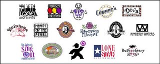
Small business logos from the designer featured in the book include that of his own business Jeff Fisher LogoMotives, and Portland businesses Balloons on Broadway, Big Daddy Marketing Specialties, Coyner's Auto Body, the Diva salon, greeting card company Good Pig - Bad Pig, retail development Heart of the Pearl and W.C. Winks Hardware. The identities for Harrison Flowers (Hood River, OR), Cooke Stationery (Salem, OR), writer Kimberly Waters (Seattle, WA), Kay Johnson's Sing Out Productions (Littleton, CO), the New England Firewood Company (Lancaster, MA), Walk Your Talk (Silver Springs, MD), Lone Star Site Design (Texas) and Buttonberry Books (Lebanon, NJ) were also showcased.

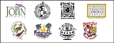
Education images exhibited in the volume include the logos for James John Elementary School in North Portland and the school's reading program, Buckman Elementary School's annual auction (Portland, OR), and an admissions program identity for George Fox University (Newberg, OR). Each year Fisher creates a graphic for the Fall Thesis celebration at Reed College (Portland, OR) and the images from 1999 through 2002 are in the book.

Organization logos for North Portland's Peninsula Clean Team, the Oregon Adult Soccer Association, the North Portland Business Association, the restoration campaign for the Vista House in Oregon's Columbia River Gorge and the Valles Caldera National Preserve in New Mexico are also highlighted. Gay/lesbian community identities in the book include those for Oregon Family OUTings (Eugene, OR) and the 2001 and 2003 logos for the annual Cascade Cup softball tournament.

The Hospice of Humboldt (Eureka, CA), Monroe Orthodontics (Aloha & Rainier, OR), the Seacoast AIDS Walk (Portsmouth, NH) and the designer's own safe sex message graphic A Rubber's Ducky are featured in the section on health-related logos.

Entertainment identities in the collection include several from the triangle productions! theatre company in Portland. Those include the play The Dream State, the company's 11th anniversary icon, the musical Naked Boys Singing, the 12th season image, and the shows When Pigs Fly, Veronica's Position, As Bees in Honey Drown, Caught in the Net, and Girls' Night Out. In addition, the logo for the Broadway Rose Theatre Company (Tigard, OR) production of Will Rogers Follies is presented.

Jeff Fisher has received nearly 500 regional, national and international graphic design awards for his logo and corporate identity efforts. His work is featured in more than 80 books on the design of logos, the business of graphic design, and small business marketing.

Fisher is a member of the HOW Magazine Editorial Advisory Board, the HOW Design Conference Advisory Council and the Board of Directors of Proscodi: Professional Society of Communication Design. His first book, The Savvy Designer's Guide to Success, was released by HOW Design Books in late 2004. He is currently writing "Identity Crisis," also for HOW Design Books, which is expected to be on bookshelves in 2007.

(* If I don't "toot!" my own horn, no one else will.)

© 2006 Jeff Fisher LogoMotives

Via planes, trains & automobiles -

a gaggle of designers descends on Seattle

I'm sitting in my high-rise hotel room in Seattle, staring out beyond the bay to the snow-covered Olympic Mountains, getting prepared for a fun and incredible weekend. Chinese President Hu has left the Queen City and, in the spring sunshine, the city has settled back to a dull roar. That will soon change. Cat Morley - of Katz-i Design, Creative Latitude, Proscodi, NO!SPEC and Designers Who Blog fame - has flown into Washington from Thailand to visit family. I first "met" Cat on the About.com Graphic Design Forum in late 1998 and we seemed to bond immediately. Others in the profession also connected with Cat in a big way on the About.com, at the HOW Design Forum, and elsewhere in cyberspace.

So, this weekend, a gaggle of designers will descend on Seattle to finally meet Cat - and each other - in person. From Florida comes Dawn Burgess, owner of Advertising by Design. (I recently met Dawn while on a trip to Orlando). Neil Tortorella - another Creative Latitude founder, principle of Tortorella Design and writer of the blog Inside the Marketing Mind - will be jetting in from Ohio. Creative Latitude editor Derald Schultz, of the Atlanta-based firm Mediarail Design, will also be joining the gang. Alina Hagen, another of the Creative Latitude crew, will be arriving from Los Angeles. Driving up from Eugene, OR will be my friend Danita Reynolds of Creative Expertise. Illustrator extraordinaire Von R. Glitschka of Glitschka Studios, and founder of Bad Design Kills and the 3 Thumbs Up Award will be joining us all - via Amtrak - from Salem, OR. (If possible, catch Von's presentation at the Art Institute of Seattle next week).

Others joining in on the fun will be About.com forum members artist Celia Martin from Walla Walla, WA and Mount Vernon, WA resident Dana Chrysler. HOWies (those frequenting the HOW Design Forum) participating from the Seattle area will include my old friend Jason Holland, Curt Hanks of Archie McPhee, designer/copywriter Maria G, Sarah Beals, and Jonathan Spier of Brown Sugar Design.

It's going to be a great weekend of getting to know each other, sharing design ideas, playing tourists and having too much fun. I'll post photos, and some tales of our adventures, later.

© 2006 Jeff Fisher LogoMotives

Calls for entries: Upcoming design competition & book submission deadlines

All of the following competitions deadlines present great opportunities to showcase your design efforts, market your work on an international scale through the published books, and "toot!" your own horn to clients, peers and the media:

Letterheads Book (David E. Carter)
Deadline: April 21, 2006

Fashion Identity (Index Books/Spain)
Deadline: April 30, 2006 - email entries to guitton@indexbook.com

Fashion Bags (Index Books/Spain)
Deadline: April 30, 2006 - email entries to guitton@indexbook.com

HOW Perfect 10 Awards (HOW Magazine)
Deadline: May 1, 2006

1000 Retail Graphics (Rockport Publishers)
Deadline Extended: May 31, 2006

American Graphic Design Awards (Graphic Design:usa)
Deadline: May 26, 2006

Sappi - Ideas That Matter (Sappi Fine Paper)
Deadline: May 31, 2006

Mohawk Show 7 (Mohawk Fine Papers, Inc.)
Deadline: May 31, 2006

The Create Awards (Create Magazine)
Deadline: June 10, 2006

Good luck!

designerID.com - not your typical portfolio site

Ok, I'll admit that I am notoriously cheap when it comes to marketing and promoting my own design business. I haven't done a self- promotion mailer in over 15 years. I don't pay for listings on design industry portfolio sites or directories. I do no Yellow Page or traditional print advertising. I don't subscribe to listings or ads in industry print directories. I'm not big on joining business-related organizations. Over the last decade I've had incredible success in seeing just how little I could spend on the promotion of my logo design work.

For the most part my promotion efforts have included entering design competitions, making use of press releases, writing articles for publications and webzines, speaking engagements and simply "working it" in other unique ways. In referring to myself (and my methods) I often say, "It's not that I don't play well with others; it's just that I want to choose where, when and with whom I play." Well, I think I may have found a place I want to "play" in designerID - and it may actually separate miserly me from a little cashola in the process.

According to the site, "designerID was developed by Brian Hock, a 15-year design veteran and graduate of Bowling Green State University. Hock refined the business strategy and concept at the AIGA-sponsored “Business Perspectives for Design Leaders” program held at Harvard Business School during the summer of 2005.Launched February 2006, designerID.com is a web-based, virtual design community serving designers, design students and schools, organizations and suppliers. It provides members with an easy-to-use way to stay in touch with fellow designers and an easy-to-search design library."

The well-designed, easy to navigate, site offers member designers use of the web site to post their profile and examples of their work; research the type of work being produced locally, nationally and internationally; send and receive emails; and receive up-to-date news on competitions, conferences, and new products. A variety of site presence options are available from the reasonably-priced menu.

In addition to being a valuable business, career and networking resource, designerID just looks and seems like a lot of fun - kind of a nice private club without the snootiness. I've already seen a few familiar faces while initially checking out the site. Don't be surprised if you see my "mug" pop up when you visit the site in the near future.

© 2006 Jeff Fisher LogoMotives

Toot! Toot!*:

Jeff Fisher LogoMotives takes

gold in Summit Creative Awards

The Portland-based firm Jeff Fisher LogoMotives was recently awarded the 2006 Gold Summit Creative Award, in the category of black and white logo/trademark, for the Neighborhood Service Center logo created for the City of Portland. The awards were created 12 years ago to recognize and celebrate the creative accomplishments of small and medium sized advertising agencies and other creative companies throughout the world with annual billings of under $25 million. Thousands of entries, from 26 countries, were submitted for consideration this year. Since 1998, Fisher has received 15 of the honors.

The Neighborhood Service Center logo project was conducted through the office of Portland City Commissioner Randy Leonard and the symbol initially identified the center housed in the historic Kenton Firehouse, located in North Portland. The service center program places neighborhood livability services personnel - including some inspections, crime prevention and permits staff - in city-owned facilities throughout Portland for easy access by residents. The logo is used on city street signage to direct citizens to the centers.

Designer Jeff Fisher, the Engineer of Creative Identity for the design firm, also served on the international panel of judges for the 2006 Summit Creative Awards. Other professionals participating in the judging process - from the United States, Kuwait, Dubai, South Africa, Canada, Germany, Bahrain, and India - represented Ogilvy and Mather, Paragon Marketing Communications, Avenue Inc, Stormhouse Partners, Memac Ogilvy, PUSH, Inc., Innocean Worldwide, Mfx, Inc., Type A Learning Agency, Tribal DDB, Cocoon Branding, Promoseven Network, Inc. and the Art Institute. When it came time to review and score the identity entries, Fisher found it necessary to excuse himself from judging his own work and familiar logo design submissions from several other designers.

Jeff Fisher has received nearly 500 regional, national and international graphic design awards for his logo and corporate identity efforts. His work is featured in more than 80 books on the design of logos, the business of graphic design, and small business marketing.

Fisher is a member of the HOW Magazine Editorial Advisory Board, the HOW Design Conference Advisory Council and the Board of Directors of Proscodi: Professional Society of Communication Design. His first book, The Savvy Designer's Guide to Success, was released by HOW Design Books in late 2004. He is currently writing Identity Crisis, also for HOW Design Books, which is expected to be on bookshelves in 2007.

(* If I don't "toot!" my own horn, no one else will.)

© 2006 Jeff Fisher LogoMotives

Say NO!LOGO to speculative “contests”

and identity design requests

The online postings and personal invitations are tempting. The opportunity to possibly have your design selected as the “winning design” for use as the identity for a business or organization may be intriguing. At times there are even prizes – cash and otherwise – to entice a designer to submit creations for the “contest.” Still, such situations are nothing more than speculative, or “spec,” design. With the introduction of the international NO!SPEC crusade I have asked identity designers contributing to past Logo Notions articles to share their personal experiences, feelings and advice on the topic of speculative work situations.

Read the rest of this article, with comments from designers Jim Charlier, Calvin Lee, Judith Mayer, Cheryl Roder-Quill, Dan Stebbings, Gianluigi Tobanelli, Madelyn Wattigney, and John Wingard in the latest Creative Latitude Logo Notions.

Also check out the other NO!SPEC-related updated articles for April on Creative Latitude.

© 2006 Jeff Fisher Logomotives

Is Papyrus the new Comic Sans?

On a recent flight I was flipping through the American Airlines publication American Way and there were way too many instances of Papyrus being used in display advertising throughout the magazine. Three logos in the issue, and one ad headline, made use of the font. After arriving in Florida, I began to spot Papyrus everywhere - on signage for real estate develop- ments, within restaurant logos, in television commercials for day spas, and elsewhere. Florida designer Dawn Burgess suggested that the font gives designers an "easy out" when looking for a typeface that hints at a tropical environment.

However, the overuse of Papyrus is not just a Sunshine State phenomenon. I've noticed it more all the time here at home in Oregon as well. It now jumps at me from newspaper ads, magazine pages and television commercials. I can't drive down a street of retail businesses without seeing Papyrus displayed on signs. How about a little originality here - Papyrus, one of my favorite places to shop, doesn't take the easy way out and use the font of the same name for its identity.

Several months ago I took on a new client, a specialist in cosmetic procedures, who used the typeface for her corporate identity. I was drowning in a sea of printed materials saturated in Papyrus. In discussing plans for her new identity she asked only one thing: That I maintain Papyrus as the primary font in her branding because she liked it so much. I somehow avoiding keening in her office at that moment - but did find myself banging my head on the steering wheel of my car a bit later in the parking lot. When back at my studio, I was able to calm down enough to send her the following email:

I will certainly steer you away from use of the font Papyrus as a primary typeface, even though you have expressed how much you like it, as it is extremely overused due to being too available to just about anyone with a computer these days. It simply does not convey professionalism or sophistication for a business at the level of yours. The organic quality of the font is not a bad thing - but the roughness of the letters contradicts what you try to achieve with an individual's personal appearance, especially when it comes to the look of better quality, smoother skin..

Success! My client acknowledged that she agreed with me after receiving my cyber missive. Then, like myself, she began to notice the font being used everywhere - day spa commercials, cosmetic procedure clinic signage, print ads in magazines, billboards and more.

Is Papyrus the new Comic Sans? In a way, the situation is very similar. Comic sans has been overused for years due to its availability as a standard font on most computer systems. For some time, designers have enjoyed bashing Comic Sans. I was recently even questioned, on an online forum, as to whether I had used Comic Sans as the font in the logo for a theatrical production. (It was not the dreaded font - I had used Lemonade). Admittedly, I am a fan of the site Ban Comic Sans.

Papyrus is not a bad font. The font itself does not misbehave. It takes someone with a computer system to overuse the typeface and use it poorly. Since being created by type designer Chris Costello, back in 1983, I'm sure it has served he and his career very well. (You really should check out other examples of his great typography work.) It's certainly not Costello's fault that his beautiful font has taken on the characteristics of a mutant life form - although I do hope he did very well in licensing negotiations. Like Comic Sans, Papyrus now comes as a standard font with many computer software programs. I asked my partner Ed (who is known as "The computer geek with social skills*") if Papyrus came with many Microsoft software programs. He was soon directing me to an online list showing that the font is packaged with Greetings 99, Home Publishing 99, Office 2000 Premium, Office 97 Small Business Edition SR2, Office Professional Edition 2003, PhotoDraw 2000, Picture It! 2000, Picture It! 98, Picture It! 99, Publisher 2000, Publisher 98, and Works 2002. Yikes! No wonder I sometimes feel as if I am being smothered in the typeface - and most of these programs are not those of choice for any professional graphic designer.

It is simply too easy for designers to make type selections from those preloaded on computer systems or packaged with software programs. The CGWSS* did also direct me to Microsoft's Fonts and Products page, which allows you to determine which fonts come with what software programs. The standard fonts on a Mac can be found on the Mac OS X 10.3 Fonts List. Perhaps such resources are valuable to designers in suggesting fonts - especially decorative or display examples - that should not be used in the creation of truly unique finished graphics.

© 2006 Jeff Fisher LogoMotives

Big surprises in a small art museum

When traveling - which I seem to do a lot (we've been spending a fourth to a third of recent years in hotels or other travel accommoda- tions) - I always like to check out the local art scene. I may visit local art galleries, pre-arrange visits to the studios of designers or artists, or take in current exhibits at a local art museum.

I hit the jackpot earlier this week in Tampa when I learned that the Tampa Museum of Art had featured exhibits of the works of Maurice Sendak and Keith Haring. I've always been fascinated by the work of both artists. To have exhibits focusing on both in one museum was almost sensory overload.

Many years ago I was introduced to Sendak's book Where The Wild Things Are. This exhibit, WILD THINGS: The Art of Maurice Sendak, displays preliminary drawings and final art for that book and so much more. Original book manuscripts, set designs, personal letters and over 100 other pieces of Sendak memorabilia are included in this beautiful exhibition. A detail description of the exhibit can be found on the site of The Jewish Museum New York, organizer of the traveling exhibition. The show will be available for viewing in Tampa until April 23, 2006.

My other purpose in visiting the Tampa Museum of Art was to view the installation Keith Haring: Art & Commerce, A Tribute to the Pop Shop. The exhibit is a tribute to Keith Haring’s Pop Shop, which closed its doors in 2005 after nearly 20 years in operation and 15 years after the artist’s death from AIDS. Keith Haring opened the Pop Shop in 1986 and sold inexpensive clothing and gift items that featured his unique designs, in a venture that critics viewed as crassly commercial, while Haring’s vision always had more to do with art than commerce. Over 100 examples of Haring's work are on display - from early high school drawings to his familiar T-shirt and poster designs. The show, organized by independent curator Jade Dellinger - in conjunction with the Keith Haring Foundation - for the Tampa Museum of Art, will be open through June 11, 2006.

A special treat was seeing works by designer and artist Ivan Chermayeff in a showing of print work in one of the museum galleries. Chermayeff is a principle in the Chermayeff & Geismar Studio, known for some of the most recognizable corporate identities and logos in the world.

The museum's ongoing permanent exhibit, The Classical World, is very much worth a good look as well. Across the Hillsborough River from the museum is the fascinating and imposing historic Tampa Bay Hotel structure - now the home of the Henry B. Plant Museum at the University of Tampa. Plant, honored by the museum in his name, built the incredible hotel in 1891. We were lucky enough to be given a tour of the beautiful building by Tampa designer (and HOW Design Forum member) Chris Baltzley. The museum and the old hotel are "musts" if you visit Tampa.

Haring Self Portrait © Estate of Keith Haring

© 2006 Jeff Fisher LogoMotives

A Winning Strategy -

-on NO!SPEC and Creative Latitude

In dealing with the issue of speculative, or "spec," design there is often confusion with the terms "contest" and "competition." A legitimate design "competition" will always be for design work already created by a designer and most often in use by the client. Such competitions will not require designers to create new work on a "spec" basis to be considered for awards, recognition or prizes. Design competitions may be a valuable marketing and promotion tool for design professionals.

In 1995 something "clicked" within me and my business began an adventure in a new and exciting direction. First of all, I made a conscious decision to focus on the aspect of the design business I had always enjoyed the most: identity design. Secondly, I finally adopted the business name I had kicked for the previous ten years: Jeff Fisher LogoMotives. The final major change came in the way I marketed and promoted myself.

I decided to no longer make use of direct mail or print advertising as a major sales tool. That bordered on sacrilege for a designer with an advertising education background. Instead, I started to give more attention to those creative industry award mailings that seemed to come my way at an increasing pace. Previously, such pieces had been sent flying towards the circular file in the corner of my studio. I simply could not justify the cost of the entry fees; especially in the case of some of my pro bono design efforts. When I was paid nothing for the finished project, could I afford to pay a high entry fee to enter a design competition?

By allocating my traditional advertising and printing budget to cover the cost of competition entry fees, the prospect of becoming an "award-winning designer" suddenly seemed more attainable. I realized that the return on the investment was much more than a certificate to hang on my studio wall and the validation creative types require on a regular basis.

Those in the creative occupations of writing, advertising, public relations, marketing, design, illustration, photography and related fields may wish to pay more attention to the available industry award possibilities. The results can have a dramatic impact on the promotion of personal creative efforts, or that of a client's company...

Read a recently updated version of the complete article A Winning Strategy: Industry awards as a marketing tool on the industry sites NO!SPEC and Creative Latitude. An updated list of design industry competition links is included at the end of the article

© 2006 Jeff Fisher LogoMotives