An initial "WOW!" for WOWIO

Design industry pal Kristin Ellison recently left her position as acquisitions editor at Rockport Publishers to become an editor at the new online freebie book source WOWIO. WOWIO went live as a resource for downloading free books a couple weeks ago. I received an email from Ellison earlier today suggesting I visit WOWIO and register, because the four original issues of Critique: The Magazine of Graphic Design Thinking had been posted in PDF format for downloading. She mentioned that more issues would be coming in the future.

I didn't need to be told twice.

A brief look at the site found classic fiction, articles and essays, historical nonfiction, comics and graphic novels among the first offerings on the site. Readers acquire ebooks via the WOWIO Web site by setting up an account, searching for the desired items and adding them to a shopping cart for checkout. I went through the relatively painless registration process and "ordered" the free Critique downloads. Within a few minutes I received an email containing a link to download the material and I was soon browsing through the issues on my PowerBook.

So, what's the catch? I don't think there is one. WOWIO makes a profit by selling advertising space in the book downloads. Advertisers place ads with WOWIO through corporate accounts with the company. Advertising campaigns are composed of full-page, full-color advertisements and a detailed profile of the target audiences. Advertisers create campaigns by targeting specific demographic groups and placing messages in ebooks ordered by customers who match the profile.

WOWIO is certainly in its infancy - but it's definitely worth an early look as a potential resource for great reading material. I know I'll be returning to check out future postings.

Trademarked logo is courtesy of WOWIO

© 2006 Jeff Fisher LogoMotives

Taking another look at a high profile "logo mill"

A tip of the engineer's cap to designer Robert Wurth and his Fresh Squeezed Droplets blog entry The LogoWorks Straw Man. As he mentions, about a year ago it was discovered that a number of the logos appearing on their site were actually plagiarized designs from other non-LogoWorks designers (including the the most amazing example to me - the Xerox digitized "X" - as in "I'd like to buy the most recognizeable 'X' in the world, please...") At the time the revelations started a flurry of activity within the design community.

Wurth responds to the company recently addressing the "myths" about their business and gets a personal response in return. I really appreciate Wurth's efforts in responsibly addressing this topic. It does make for very interesting reading.

NOTE: Check out Wurth's followup entry: Don't touch that logo!!

You've got to love a blog called FontLover

OK, I'll admit it; I'm kind of a "font geek." I'm often called by that name and will automatically respond to it. However, I'd much prefer to be called a "font lover" - and I recently came across FontLover.com in its revised blog form. I hadn't been to the URL in some time. In cleaning out my "favorites" I thought I'd check out the link. I think I've rediscovered font heaven. Recent font news, new releases, reviews of typography books and products, and links galore to great foundries have been collected in one great online design resource.

According to the the "about" page on the site:

"Fontlover.com began in November of 2000 as a brainstorm. That was when all the email-update services suddenly became pay services and sending out constant updates annoyed people so the idea was born that there should be a place to get updates at a website that you could visit daily and as a bonus not have your email box filled up. There was this new thing called blogging and I thought…. that’s it!"

Well, they did it right. I think I've rediscovered one of the most productive online time-wasters I've come across in a long time. This "font lover" looks forward to visiting the resource on a regular basis.

© 2006 Jeff Fisher LogoMotives

Winners of the European Logo Design Annual

(Eulda) 2006 showcased online and in future book

Eulda, (the European Logo Design Annual) a new high-profile graphic design award competition to recognize the finest logos designed in Europe, has announced its winning selections for 2006.

The “Best of Europe” selection is the identity for Grutas e Centro do Vulcanismo (shown at left), a volcano information center near Portugal's São Vicente Caves. The image was created by designer João Pacheco of Shift Design. A detailed explanation of that design, and the “Best of Nation” selected identities, may be found on the organization's site. All the winning logos for 2006 will be published in a hard-bound volume to be released later this year. Copies of the book may be reserved through the Eulda web site.

In the inaugural Eulda event, 378 logos selected were selected from the nearly 1,000 entries representing 36 different countries. The competition was judged by an international three-tier jury consisting of 10 top design professionals, 10 marketing managers from major international clients and 10 members of the consumer public. This judging method reflects the actual process that turns any logo idea into a successful logo: the designers decide what to present to the clients, the clients decide what to present to the public, and in the end the public will determne if they like the logo and will embrace the new image of the service, organization or product.

Some of the winning logos are fun, refreshing and incredibly clever. In reviewing the displayed winning selections, I suppose the biggest surprise for me was seeing examples conveying a bit of the swoosh-o-locity of the past decade. I am curious, due to the multiple colors, gradients and overlays of some of the selected logos, if those making submissions were required to exhibit how their creations might translate to possible one-color applications a client might want or require. I look forward to seeing the complete collection of selected identities when the Eulda book is released later this fall.

© 2006 Jeff Fisher LogoMotives

Hey, I'm upside down!

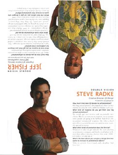
Yesterday the Self-Promotion Design Annual issue (October 2006) of the design industry publication HOW Magazine appeared in my post office box. There, on the last page of the issue, is a photo of yours truly hanging upside down. It's the "Double Vision" feature of the magazine, in which the editors ask two design professionals the same questions on a given topic. With this being an issue on self-promotion, the questions are about marketing and promotion efforts.

As subscibers began receiving their magazines it was posted on the HOW Design Forum that I was in the issue - upside down. Bryn Mooth, editor of the publication, posted "Jeff, we just HAD to put you upside down!" Yes, the HOW staff know me just a bit too well - and, I should mention in the interest of "public disclosure," I am on the HOW Editorial Advisory Board.

My responses to the questions asked include references to the fact I spend about 20% of my business time on marketing efforts, my "Toot! Toot!" press releases are an effective promotion tool, bLog-oMotives has become a major part of my self-promotion, and designers need to schedule their own promotion projects as they would any client job.

By the way, photographer Vicki Grayland got the gig to shoot my photo as a direct result of her own self-promotion efforts. For several years she sent me her "Metropolitan Refrigerator of Art worthy" marketing postcards. I posted them above my desk as a reminder of Grayland's beautiful work. When HOW needed me to suggest a photographer to take my photograph she was the first person that came to mind.

Grayland was coming down from Seattle and wondered if I had any suggestions for a location. A couple ideas didn't pan out and at the last minute I thought about the great lobby at the Art Institute of Portland - the whole facility, in the heart of Portland's Pearl District, is incredible. Having been a speaker at the school, I attempted to contact people I knew there by email and phone the day before the scheduled shoot. I was out of luck as it was a day the staff and instructors were off. So, I left a message for the school's career advisor that we were going to use the lobby for the shoot and if anyone asked I'd say he approved it. I mentioned in my voice email that I would accept any consequences later.

The photographer and I showed up in the lobby that Saturday. We told the receptionist we had permission to do a photo shoot at the school. She didn't question a thing. And then, for the couple hours we were there, not a single person (including security) ever asked what we were doing. That following Monday I got an email from my school contact suggesting that I might want to be on their professional advisory committee. Not really a bad "payback" for use of a great location.

A large number of people have commented on the shirt I'm wearing in the photo - in person, via email and on design forums. It's a Tommy Bahama that my partner Ed bought me this year on our annual vacation to St. Croix. It seems that others in the design industry think I'm very easy to find at conferences and professional gatherings when I'm sporting an item from my ever-growing tropical shirt collection.

The Self-Promotion Design Annual will soon be hitting your neighborhood newsstand. Check it out for great examples of recent promo designs, informative articles (including those written by my friends Ilise Benun and Neil Tortorella, writer Pat Matson Knapp - who wrote about my business in the past HOW articles Shedding Stress and Lost in Translation, and fellow "HOWie" Nikita Prokhorov) and other information of value to graphic design firms of any size. I probably should also mention that the "non-upside down" guy on the Double Vision page is Steve Radke, Creative Director of the firm GS Design.

...guess I'd better get to work and start "tooting!"

© 2006 Jeff Fisher LogoMotives

Mozilla Firefox logo is out standing in the field

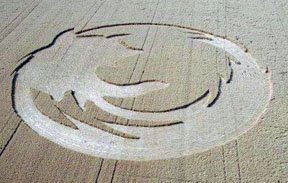
Oregon State University helped the Mozilla Web browser company celebrate a milestone last weekend with a crop circle carved in the shape of the Mozilla Firefox logo. Students carved the logo in an oat field owned by a McMinnville, Oregon area farmer to celebrate 200 million downloads of the Mozilla Firefox browser. The university supports Firefox because it is so-called "open source" software — publicly available software that has challenged Microsoft for access to the Internet.

The "crop circle" crew included OSU senior Alex Polvi, a McMinnville High grad interning with Google in Manhattan. Polvi grew up on a farm in the Amity-Hopewell area, so his roommate suggested he might know of an appropriate field. Polvi quickly located the kind of tract the crew was searching for — a field owned by Monte Wood. The crop circle is at SE Amity Road and Lafayette Highway, southeast of McMinnville.

On Friday, using boards tied to lengths of rope, the students flattened the field according to a plan laid out on a grid. The project took 14 hours, including a marathon session that concluded Saturday morning. More information about the crop circle project can be found on the OSU Linux Users Group site - including a gallery of photos

Asa Dotzler, community coordinator for Mozilla, told the (McMinnville) News-Register newspaper that he laughed off the crop circle idea at first, but was swayed by the enthusiasm of the planners.

"That's something money can't buy," Dotzler said. "We have all these really loyal fans who do crazy antics."

OSU's Open Source Lab is the global download source for Firefox. The facility serves as a distribution, education and research center for the open-source community and receives support from Google, Red Hat, Linux and many other high-tech organizations.

Google, the Internet search company, arranged for a special satellite flyover so the 200-foot Firefox crop circle logo can be shown on Google Earth (download required), which features high-resolution photos from space.

Steven Garrity, creative director of the firm silverorange, led the Mozilla Visual Identity Team in developing the logo for Firefox. Read more about the process in his blog entry Branding Mozilla: Towards Firefox 1.0

Source: AP • Photo: Oregon State University

Calls for entries:

Upcoming design competition deadlines

All of the following competitions deadlines present great opportunities to showcase your design efforts, market your work on an international scale through the published books, and "toot!" your own horn to clients, peers and the media:

Call for Posters - Subvertisements: Approaching Logos for Protest. For more information visit the web site of The Center for the Study of Political Graphics
No entry fees

Call for Posters on Immigration - No Human Being is Illegal!: Posters on the myths and realities of the immigrant experience. For more information visit the site of The Center for the Study of Political Graphics
No entry fees

1,000 Restaurant, Bar, and Café Graphics (Rockport Publishers)
Deadline Extended: August 31, 2006
No entry fees

Creativity 36 (David E. Carter)
Deadline: September 1, 2006
Entry fees charged

HOW International Design Awards (HOW Magazine)
Deadline: September 1, 2006
Entry fees charged

1,000 Retail Graphics (Rockport Publishers)
Deadline Extended: September 15, 2006
No entry fees

Image Management and Reproduction (Rotovision)
Deadline: September 15, 2006
No entry fees

Step inside design 100 (Step inside design Magazine)
Deadline: October 2, 2006
Entry fees charged

LOGO 2007 (David E. Carter)
Deadline: October 31, 2006
Entry fees charged

You may want to read my article about participating in design industry competitions: A Winning Strategy. It has appeared on the Creative Latitude and No!Spec web sites.

Good luck!

Cultural considerations in designing the

Young Native Writer's Essay Contest logo

I recently was asked to design a logo for the Young Native Writers' Essay Contest sponsored by the Holland + Knight Charitable Foundation. The foundation, funded through contributions from the Holland + Knight law firm, its attorneys and staff - as well as external sources - underwrites a variety of education-related programs. One of those programs is the Young Native Writers' Essay Contest, which is designed to inspire honest portrayals of the richness of Native American life and history. In 2006 the writing contest was dedicated to Native American high school students within the Red Lake community in the state of Minnesota. Expansion into additional Native American communities is slated for the 2006-2007 school year.

With the upcoming expansion into other Native American communities came the desire to create an identity for the program that would convey a graphic message not limited to one Native American nation. Symbols and graphic elements specific to any one tribe would not work. My immediate thought was to incorporate an eagle feather into the design as a writing pen. Still, I wanted to know if such a graphic would be appropriate.

My friend Myra Donnelley, a Portland playwright and one of my Thursday morning "koffee klatch" buddies, works with the local Native American Youth & Family Center and the Young Native Playwrights Project. I thought she'd be able to provide some great resources.

One email to Myra put me into contact with the incredible Jeanne Givens. She's a member of the Native American Stewardship Council at the Autry National Center, Chairperson for the Institute of American Indian Arts (IAIA) in New Mexico, and a member of the Coeur d'Alene Tribe. We had a great visit and she did confirm that my idea of the eagle feather would be appropriate and non-offensive to all tribes. She did mention that the feather should be shown horizontally - which I had already planned. It was recommended that I not incorporate any other Native symbolism into the design to make it as all-inclusive as possible.

The eagle feather conveys many symbolic messages. Being half black and half white, it projects graphic imagery of daylight and darkness, peace and war, and summer and winter. Such feathers symbolize trust, honor, strength, wisdom, power, freedom and a closeness to the heavens. The symbol also conveys good luck to both the giver and receiver. The powerful image of the eagle feather is used in many ceremonial rites, and for healing purposes, by many tribes. For those reasons and more, the eagle feather seemed like the perfect graphic to represent a writing program for Native youth writing about their heritage.

A simplified eagle feather image (exhibited as a writing pen) was combined with the font Ashwood Condensed, from The Walden Font Co., and the existing foundation identity to create the logo. The earthy color was adopted from the H+K corporate color palette and I selected the purple to project the additional qualities of creativity, richness, fun, mysticism and mystery.

I sent the final design off to Angela Ruth, Executive Director of the H+K Charitable Foundation, and received a quick response that she, the Marketing Materials Manager, and others within the organization "loved it!" With the approval of the group's Native lawyer the logo was a "go." The image will be used on T-shirts for essay contest participants and on marketing/promotion materials for future years.

© 2006 Jeff Fisher LogoMotives

Jeffism #5

"To err is human; to create something positive from the situation is design.”

- Jeff Fisher (from his book "The Savvy Designer's Guide to Success")

Design studio housecleaning - excavated artifact #4

It's amazing what I find while cleaning out old files. I guess I should be pleased that I've seldom thrown anything away during my career. There, stuck in a totally unrelated file folder, was a piece of paper with couple of phone messages from sometime in 1986 when I was sharing office space with City Guide Magazine, the Seattle Men's Chorus, the Alice B. Theatre company and the Pride Foundation. The yellow paper has even more yellowed scotch tape on it and a thumb tack hole where I probably stuck it on a bulletin board at some point. The messages said "Jeff Hest called - will be at the Ritz @ 5 pm" and "Ken D. called." Jeff was one of my best buddies when I lived in Seattle, the Ritz Cafe (long since closed) was one of our favorite bars, and Ken D. (Decker - now long deceased) was a great friend and client.

The phone messages were not why I've saved the scrap of paper for about 20 years. Also on the paper were the doodles of what were to become a logo and T-shirt design.

The late 80's found the U.S. dealing with the ever-growing AIDS crisis. At the time I was doing design work for a number of AIDS and health organizations in both Seattle and Portland. Part of my work involved getting safe-sex messages across to the general public. I'd been kicking around the idea of a graphic proclaiming "A Rubber's Ducky" - or, in other words, "a condom is a good thing" - for some time. Obviously, that idea manifested itself in the sketches on a message pad.

The original concept was for the traditional rubber ducky we played with as a kid to have its head sticking out of a nautical life preserver. The text "Rubber Ducky" appears in the first very rough sketch. The beginnings of what were to be the duck image, with a hint of rope, appear in the second rough.

As the design was fine-tuned, the life preserver took on the more realistic look of those on a friend's boat. The duck somehow developed the reservoir tip of a condom on the top of its head and - in the stencil type often seen on sea-going vessels - the text became "A Rubber's Ducky." The result is still one of my personal favorites in the vast collection of identities I've designed. In part, I'm sure due to the cute and clever incorporation of the serious safe-sex message. A few T-shirts were produced for friends back then. Mine has long since worn out. Perhaps it's time to produce a new batch for the current generation that might benefit from the message.

The image has kind of taken on an international life of its own. It appears in the Japanese book New Logo & Trademark Design (republished in paperback as Logo and Trademark Collection), the first book in the LogoLounge series and in the recent Spanish volume Logos from North to South America. It also was recognized with LOGO 2001 honors and, as a result was published in the book The Big Book of Logos.

The process of going through 30 years of design files is tedious and somewhat exciting. I'm cataloging and archiving all examples of my work - and certainly not throwing anything away. I'll be sharing more past projects in the future. You will also find past shared excavated artifacts in examples #1, #2, and #3.

© 2006 Jeff Fisher LogoMotives.

Creativity Awards closes book on cover "contest"

I've always been a huge fan of the design competitions conducted by David E. Carter, resulting in books such as the American Corporate Identity, The Big Book of Logos, and Creativity series. In addition to those volumes, works submitted are often considered for inclusion in other books Carter has written. Having my work included in 17 Carter books to date has been a great source of marketing and promotion of my design work

Last Thursday, I was somewhat stunned when opening an email with the subject line "Design the Creativity Cover" to find that a "contest" was being conducted to select the cover of the upcoming Creativity 36 volume. The email had the headline "Be the first on your block to design Creativity's cover." The text continued with:

"We are inviting you to show us how good the Creativity Annual covers can be. Because it is the first time, we know it is hard to resist.

There are zero entry fees, one winner and only two rules. The recognition you will receive for designing the Creativity 36 cover is immeasurable. If we have peaked (sic) your interest, click this link to creativityawards.com.

The winning design will be chosen this winter by Creativity Awards and HarperCollins, the book's international publisher. The winning designer or firm will be featured on our website and in our promotional campaign.

The Creativity Cover Competition deadline is October 15, 2006. Non-winning entries will be considered for subsequent Annuals."

As I read the email I could feel the hairs standing up on the back of my neck. I was really offended that a speculative "contest" was being conducted for such a purpose. I immediately responded with the following email:

"To whom it may concern:

I'm surprised that the Creativity Awards and Harper Collins are conducting a speculative design contest to select a cover for the Creative 36 publication. Being leading entities in the industry I would have thought both organizations would know better."

I also included the URL of the NO-SPEC! web site as a resource for more information. In addition, I brought the issue up on several online design forums for the discussion and reactions of others.

For me, the distinction between "design competition" and such "contests" is very simple. "Competitions" are conducted to evaluate and select graphic work already completed by a designer. Most so-called "contests" are requests for the creation of new work for possible review and selection - and that is "spec," or speculative, work. No designer should be asked to work for free as a condition for the chance of being selected as the "winner" or possibly being hired for future work.

Today I was surprised to receive an email from Tim Moran, the Director of Marketing for the Creativity Annual Awards. The subject line read "Creativity Cancels Cover Contest." The content of the email message was:

"Dear Creative Professionals,

Members of AIGA and several other graphic designers have expressed to Creativity Awards their disappointment over our cover contest. They have described this contest as speculative and against the profession’s code of ethics. They believe this kind of speculative work devalues graphic designers’ time, energy and creativity, all of which are crucial elements of the work we celebrate each year in the Creativity competition.

We agree.

Please accept our apology for this mistake. We are canceling the Creativity cover design contest immediately. We appreciate your caring enough to provide honest feedback to us, and will resume our policy of hiring a professional designer for this work."

I really appreciate the fact that the Creativity officials took the input of design professionals seriously in regards to this issue and re-evaluated the "contest" they were conducting. I'm impressed with the manner in which they have handled the situation. It instantly reconfirmed my faith in the professionalism of the Carter organization. I did take the time to send of a short "thank you" email to the Creativity Awards. I encourage others to do the same. You may send your messages to the attention of Tim Moran at info@creativityawards.com

Note: Thanks to No-Spec and The Zehnkatzen Times for their mentions of this blog entry.

© 2006 Jeff Fisher LogoMotives